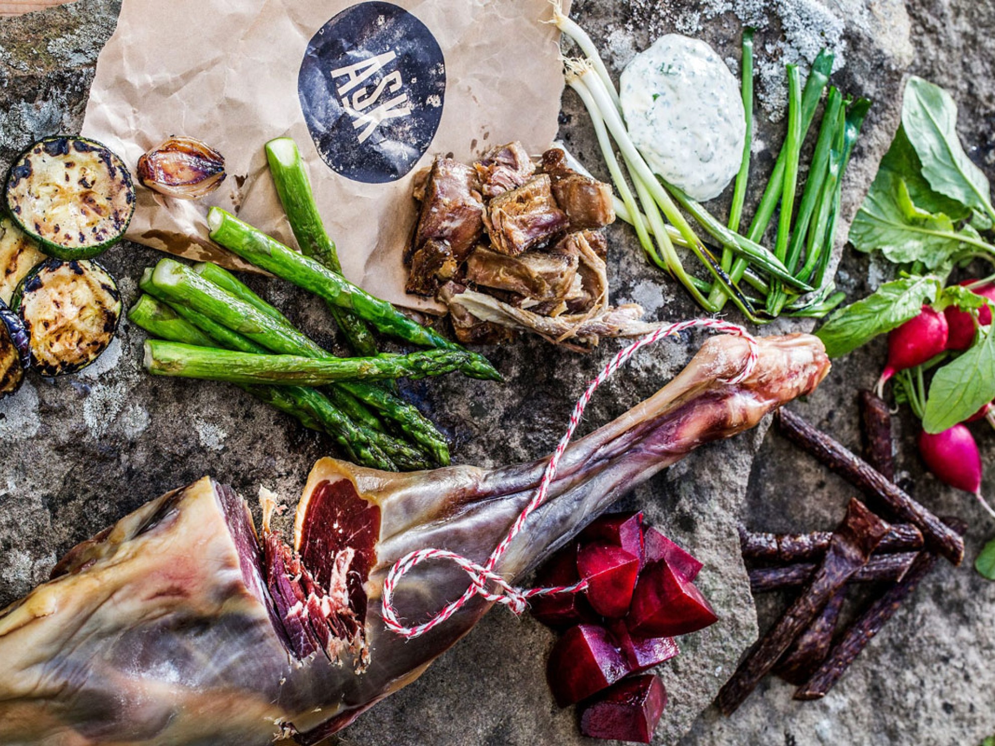
Married couple Kristoffer Evang and Anne Marte Ruud Evang started Ask farm in Jevnaker in 2013. They wanted to challenge the meat industry and offer an organic alternative based on sustainability, animal welfare and quality. With Norwegian ingredients, they make cured meat based on Italian tradition.
The corona required a new sales strategy
Originally, Ask sold the products through gourmet restaurants and delicatessens, a strategy they quickly had to change in March 2020 when the shutdown caused large parts of sales to disappear overnight. The solution was to establish an online store with complete design, inviting photos and recipes made by famous chefs. Helped by the grocery chain Meny's investment in local food taxes, the pandemic year 2020 was a good year of growth for Ask Gård.
Registered rights protect against copying
– Since the design of ASK is an essential part of the entire product, it is extremely important for us to ensure that no one else copies our expression and our values. We ensure this by protecting our names and our font through trademark and design registration. You see all too often that competing companies do not bother to invent the gunpowder themselves, but simply copy what sells. From day one, we wanted to secure ourselves against this.
Kristoffer Evang
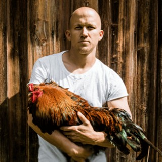
Kristoffer Evang
Design language and use of color are important in branding
"For ASK, design and packaging have always been important. We are both educated in art and graphic design, and had this as a profession before the sausage adventure took shape. We have worked hard on branding and positioning, and through design language and colors we have managed to stand out and establish a recognizable expression", says managing director Kristoffer Evang.
"This was basically done so that the consumer would quickly recognize the product. We weighted the packaging based on three elements: brand, i.e. ASK, color and name/product. The aim was for the customers to remember the brand name ASK even if they did not remember which sausage they bought last. If they remembered ASK and had to find the type of sausage, we thought it was easier to remember a color than an unfamiliar brand name. Thus we ended up with ASK sausage with a red colour.'
The Ekvang couple wanted to establish product names that would stand out and tell a little about who they are as a company. They built a narrative for each product name, so they could easily create a story around the product. For example "PABLO" chorizo: "Pablo is a chubby Spaniard, a slightly chubby type who likes to enjoy a cold one in the sun. He has a brother named Pedro. Pedro is an angry type with a lot of aggression. We thought that the sequel sausage could be called "PEDRO" and be a strong version of "PABLO". By creating little stories and meanings behind the names, we had more to play with in commercials and marketing," says Evang.
On the team they have had a designer who has been responsible for the entire ASK profile - Sindre Trolsås. He has developed the font and built up the graphic style around ASK.
- The design is based on the font ASK. It is built up of vector-based sausages in three formats, which together form the entire language. This means that we are easily recognisable, and we easily detect if someone is trying to copy us. At the same time, it is easy to launch new products; it is fine to write the name in our font, Kristoffer Evang, ASK farm
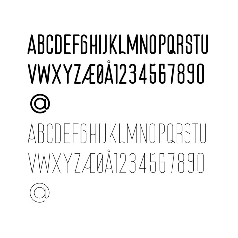
The font is used on everything from packaging, brochures, sausages, catalogs and also on the new production building.
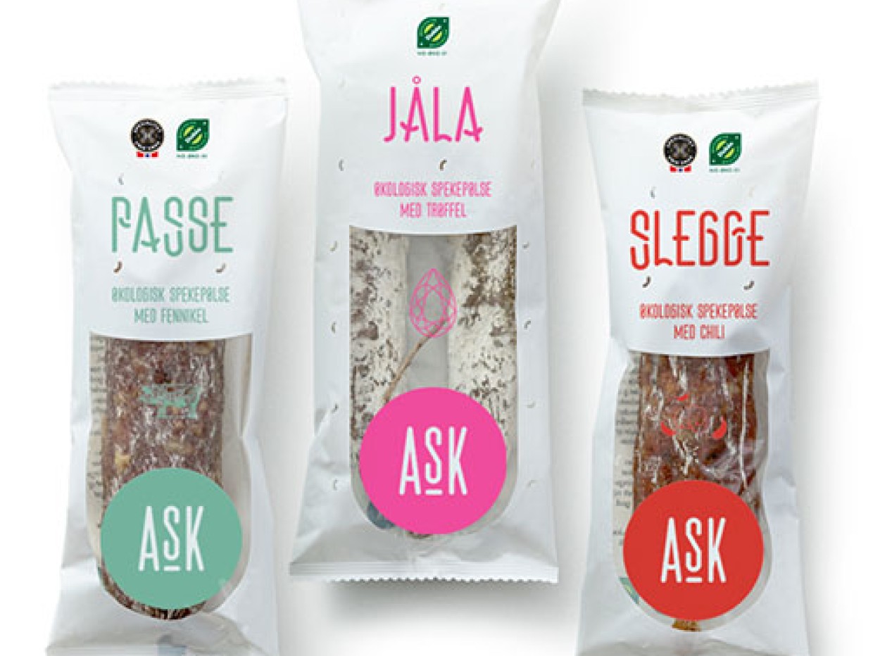
"We believe it is time to come up with something new in the meat industry. Meat has black as its colour, something we wanted to challenge. Both to differentiate ourselves from the established market, but also because of the environmental aspect. Black plastic is the worst, and the additive Carbon Black is banned in several countries. At the same time, black plastic is recycled as residual waste because the sorting machines cannot distinguish between black rubbish bags and black packaging", concludes the entrepreneur.